
-
What we did
UI/UX Design & Development -
Client
KFC -
Delivered
September 2019 -
Visit Website
Project info
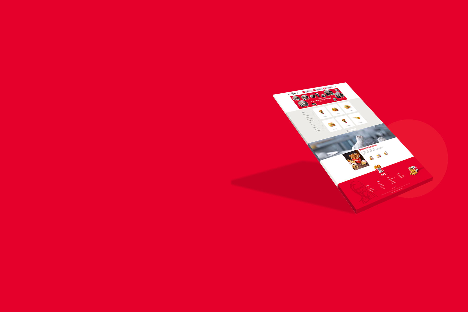
KFC hired Zero Negative to build a website for their expansion into a new region. Although KFC has long been a household name in the United States, there are still emerging markets that are unfamiliar with the KFC brand. As such, Zero Negative took great care in carrying the KFC name into this new endeavor, collaborating with KFC's new foreign partners to create an appealing, mouth-watering site that would surely give them a warm introduction.
The Design
For this project, the client requested a more simple, traditional design that would be easily understandable and navigable within the new target market. Although bold and cutting edge design is often our preference, there’s something to be said for simplicity, especially when you are undertaking the delicate task of introducing a brand like KFC into unfamiliar territory.

it's finger licking'good


